ART.2008.04.
DUTCH ANGLE
Animation, 3D (c.g.)
Run time: 5 min.
__________________________________________________________________
DUTCH ANGLE SYNOPSIS
In this 3d-animation the relation is being examined between our national identity, commerciality and globalization. That is an inquiry into national branding, its control and its artificiality.
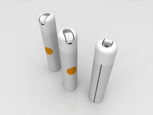
The work shows a formal and sterile environment in which consistent the same corporate identity has been carried through. Being displayed are branded spaces that breath the atmosphere of a uniform, totalitarian system, which is only being emphasized by a cheerful, repetitive tune as well as the mechanical camera movement. Throughout these commercial spaces several "typical" Dutch elements have been used; the ball shooting game, the quinces, the Rietveld chair and the color orange. However, the exact function of the rooms remains unclear. It's left an open question whether the depicted spaces show the world of the tourist or maybe even that of the asylum seeker. It's unclear whether the to artist impressions related images welcome or menace the user. The in marketing always present tension between seduction and fear is translated to the topical issue of globalization. Hereby the national logo can be read as a metaphor for the upcoming commercial identity at the expense of a decreasing classic national identity.
Originating from the film world is the technical term Dutch angle, which is used to indicate a camera standpoint where the horizon has been shot diagonally, basically to cause a disorientating effect to evoke a feeling of unease or alienation.
__________________________________________________________________
